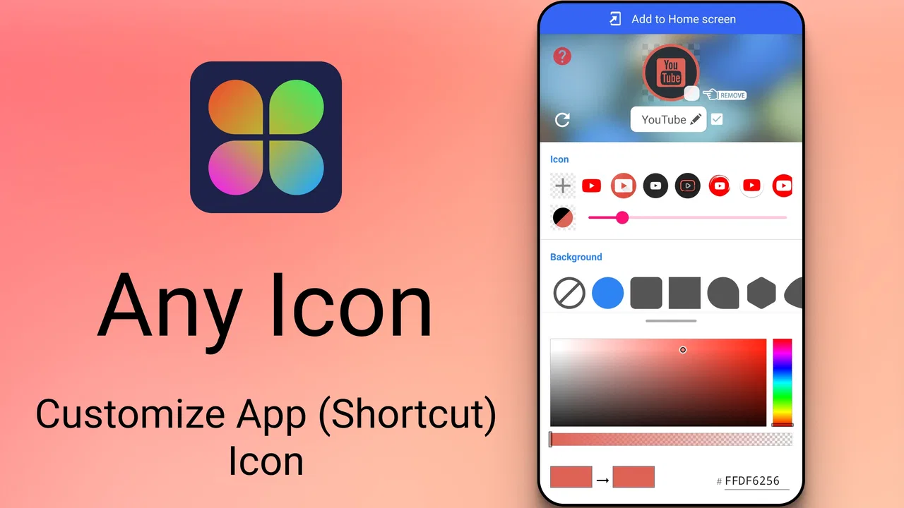
Icon Changer
- 4.4
- Rating
- 10.00M
- Installs
- Free
- Price

 Analysis by App-foxy
Icon Changer is the kind of personalization app I notice most when I want my phone to feel more like mine without rebuilding the entire launcher. Its purpose is focused: changing the appearance of app icons. That narrow goal is also its appeal. I do not have to commit to a complete home-screen replacement or learn a complicated theme system before making a small visual change.
After spending time with it, I see the app as a practical tool for people who care about the look of their home screen but want to keep their existing arrangement and daily habits. It is free, aimed at everyone, and developed by Any Studio. The app belongs to the personalization category, and its current version is 1.8.8, with support beginning at Android 5.0. Those details make it accessible to a wide range of Android users, including people with older phones.
The overall experience is straightforward, but it is not completely frictionless. Icon customization sounds simple until you consider how often images load, how much time you want to spend choosing a design, and what happens when a shortcut does not behave exactly like a built-in system icon. These practical details matter more than the short description suggests.
You May Also Like

 Blood Strike: 2.5 Anniversary
Blood Strike’s Loadouts Turn Every Drop Into a Tactical Gamble
A close look at Blood Strike’s custom loadouts: how fast access to signature weapons reshapes its battle royale rhythm, rewards preparation, and narrows the gap between fights.

 Pandora - Music & Podcasts
Pandora’s Music Is Easy to Start, but Harder to Recover
Pandora’s strength is its low-effort path from a seed to a station. Its weak spot is how much confidence it asks you to place in connection, setup, and quiet recovery.

 8 Ball Pool
 Is Built on Rivalries, Rematches, and Routine
A close look at the rivalries, rematches, shared routines, and unanswered safety questions that turn a quick pool match into a persistent mobile community.

 Samsung Music
’s Quiet Strength Is Playing What You Already Own
Its reach comes less from spectacle than from dependable access to a personal library. That simplicity is both the app’s strongest retention engine and its ceiling.

 AccuWeather: Weather Radar
AccuWeather Review: A Quick, Clear Forecast for Everyday Decisions
For everyday plans, the best forecast is the one you can understand quickly. AccuWeather makes rain timing, radar, and local conditions easy to act on, with a few trade-offs.

 Hill Climb Racing
Why Hill Climb Racing Still Turns Crashes Into One More Run
A tiny car, a bumpy hill and one more upgrade: Hill Climb Racing keeps resurfacing because its simple chaos makes every near-miss feel personal.
More From Our News Desk
View All News


Changing the look of a home screen in real life
The first useful way to think about this app is as a shortcut-making and visual organization tool rather than a full launcher. I can keep the phone’s familiar navigation, folders, widgets, and app positions while giving selected icons a different appearance. That makes it suitable for gradual changes: I might start with the apps on the first page, then decide later whether the rest of the screen needs attention.
That gradual approach is one of the app’s strongest qualities. A complete theme can look impressive in screenshots but feel like too much work when I only want to improve a few icons. With Icon Changer, I can treat personalization as a small project instead of an all-or-nothing makeover. Someone who wants a calmer first page, a more consistent color palette, or a playful arrangement can work toward that result at a comfortable pace.
In everyday use, I would begin with the apps I open constantly: messaging, maps, email, music, and the camera. The goal is not merely decoration. Distinctive icons can make familiar positions easier to recognize, especially when I use the phone quickly while walking between appointments or checking something in a bright outdoor setting. The visual benefit is modest, but it can make the home screen feel less cluttered.
A useful workflow is to choose one visual idea before editing anything. For example, I might decide on muted colors for work apps and brighter designs for personal apps. If I change icons one by one without a plan, the screen can become less coherent than it was before. The app gives me the ability to customize, but the design decisions are still mine.
Why the network can shape the first impression
Connectivity becomes relevant whenever the customization process involves finding or loading visual material. If I am browsing for an image or waiting for content to appear, a weak connection can make the experience feel slower than the simple task deserves. This is especially noticeable when I am trying to make several changes in one sitting and each choice interrupts the rhythm.
I would therefore avoid starting a large icon project during a rushed commute or in a place where the signal is unreliable. The app is more enjoyable when I have a stable connection and enough time to compare options rather than accepting the first image that appears. This is not a criticism of the core idea; it is a reminder that visual customization often depends on a smooth flow of loading, previewing, and confirming.
There is also a practical distinction between preparing a design and using the finished home screen. Once the icons are arranged, opening an app is mainly a normal phone action. The network-sensitive part is more likely to be the discovery and setup process than the simple act of tapping a shortcut. I would not treat that difference as a promise of offline behavior, but it helps explain why the experience can feel fine one moment and inconvenient the next.
For users with limited mobile data, the sensible habit is to do the creative work over a trusted connection when possible. I would browse and select images deliberately instead of repeatedly opening and closing choices. That reduces unnecessary loading and also prevents me from making impulsive changes that I later have to undo.
A realistic mobile scenario
Imagine I have just bought a phone case in a soft green color and want the home screen to match it. I have ten minutes before leaving for work, so I open the app and start with the first row of icons. I choose a restrained style rather than changing every app, place the new shortcuts where the originals were, and check whether the labels remain easy to read.
If the connection is strong, this can be a pleasant small task. If I am in a basement or moving through an area with inconsistent reception, I would postpone the browsing portion instead of fighting the interface. The important lesson is that the app fits short personalization sessions best when I separate planning from hurried execution. A few intentional changes are more likely to look good than a rushed full-screen overhaul.
This scenario also exposes a trade-off: a customized icon may look better but be less immediately recognizable than the standard one. I would keep the most important apps visually obvious and reserve experimental designs for secondary apps or folders. Personal style should not make essential actions harder to find.
What happens when a change does not look right
Any shortcut-based customization can create small moments of uncertainty. I may choose an image that looks attractive in a preview but feels too busy at the actual icon size. A label may compete with the artwork, or the new icon may stand out so much that it disrupts the surrounding layout. These are not reasons to abandon the app, but they are reasons to review each change on the real home screen rather than judging it in isolation.
My preferred recovery method is simple: change one icon, return to the home screen, and test it before moving on. If the result is confusing, I can replace that choice instead of having to untangle a complete redesign. This one-at-a-time process is slower initially, but it makes mistakes easy to identify. It is also useful for people who are not confident with customization tools.
I would keep the original app location in mind while editing. Moving an icon and changing its appearance at the same time makes it harder to remember where the app went. Keeping the position stable gives me a reliable fallback if the new design is not useful. It also makes the transition less disruptive for anyone who shares or occasionally uses the phone.
Another recovery tip is to judge the result in more than one situation. A pale icon may look elegant in a dim room but disappear in daylight. Fine details can lose their meaning when the phone is viewed quickly. I would check the screen with normal brightness and with the surrounding icons visible. The best choice is not always the most detailed one; it is the one I can recognize without hesitation.
Managing expectations on an older Android phone
Support for Android 5.0 makes the app relevant to users who are not carrying a recent device. That is valuable because personalization should not be limited to expensive or new hardware. At the same time, older phones can make any image-heavy browsing or editing experience feel less immediate, particularly when storage, memory, or connectivity is already under pressure.
If I were using an older device, I would keep the project modest. I would avoid repeatedly changing the same icon, close other demanding apps, and give each preview time to appear before tapping again. Repeated taps during a delay can create confusion about whether a choice was accepted. A calm, step-by-step workflow is more reliable than trying to force a faster response.
The app is also a better match for people who want selective personalization than for users who expect a complete system-wide visual overhaul. A launcher or a dedicated theme system may offer deeper control over grids, gestures, widgets, and global styling. Those alternatives can be better when consistency across the entire interface matters more than the convenience of changing individual icons.
On the other hand, a launcher can alter habits I already like. It may introduce a new app drawer, different gestures, or another layer of settings to maintain. Icon Changer is appealing precisely because it focuses on the visible result while leaving the broader phone experience familiar. The trade-off is less control over the overall system design.
Data-conscious habits that improve the experience
Because visual customization can involve loading images, I would approach the app with the same care I use for any media-oriented tool. I would prepare a short list of the icons I actually want to change, choose a consistent style, and avoid endless browsing. This saves time and helps me make a screen that feels intentional rather than crowded.
A useful tactic is to create a small visual rule for each page. One page might use simple monochrome artwork, while another uses colorful images for entertainment apps. Separating styles by page makes it easier to notice which choices are helping and which are merely adding noise. It also means I do not need to customize every icon to achieve a noticeable result.
I would also be careful with images that contain tiny text or complicated backgrounds. They may look impressive when viewed up close but become indistinct in a small shortcut. Simple silhouettes, strong contrast, and a clear central shape generally make more practical icons. This is an important trade-off that a quick store summary cannot explain: the most attractive source image is not necessarily the most usable icon.
When I am on a limited connection, I would postpone experimentation and use a stable network for the selection stage. I would not repeatedly refresh content simply to compare minor variations. If the app lets me work with an image already available on the phone, that can be a more controlled approach, but I would still judge the result on the home screen and not assume that every image will scale equally well.
These habits also make recovery easier. If I change only a handful of icons per session, I know which choice caused a problem. If I alter the entire phone at once, diagnosing an awkward result becomes much more difficult. The app rewards a measured process more than rapid tapping.
Who will enjoy it, and who should choose something else
I would recommend this app to Android users who want a personal touch without replacing their launcher. It suits someone decorating a new phone, organizing a work profile visually, matching a seasonal style, or simply making a familiar device feel less generic. It is also approachable for people who have never used a personalization tool before because the goal is easy to understand.
It can be especially useful for a selective makeover. A student might distinguish study tools from entertainment apps, while someone working from home might create a calmer first page for video calls, notes, and calendars. A family member who finds standard icons difficult to distinguish could also experiment with clearer visual differences, although readability should remain the priority.
I would skip it if my main goal were a fully unified interface with custom widgets, lock-screen changes, gesture controls, and system-wide typography. A launcher or a broader theme solution would be more suitable there. I would also hesitate if I dislike managing shortcuts or if I need every icon to behave and appear exactly like a native system element.
People who change phones frequently should consider the maintenance involved. A carefully arranged screen may need to be recreated after moving to another device, and a large collection of custom choices can become a small chore. For occasional decoration, that is reasonable. For a setup that must be reproduced quickly and identically, a more integrated theme system may be the better fit.
How the app compares with familiar alternatives
The usual alternative is to leave the default icons in place. That option is fastest and most dependable, and it avoids any visual mismatch between shortcuts and the rest of the phone. If I value speed above personality, the default setup wins. It is also the better choice when I share a device or need other people to recognize every app immediately.
A launcher offers a wider design canvas. It can change the arrangement, drawer behavior, widgets, and gestures along with icon appearance. That depth is useful for enthusiasts, but it also means more settings and a greater chance of disrupting routines. Icon Changer occupies the simpler middle ground: more personal than the default screen, less invasive than replacing the launcher.
Dedicated icon packs can provide stronger visual consistency when they support the launcher I already use. Their advantage is a coordinated collection rather than individual image decisions. The disadvantage is that an icon pack may not cover every app I have installed, leaving mismatched symbols or requiring extra adjustments. This app is more appealing when I want freedom to customize selected icons rather than adopt one fixed collection.
My judgment is that the best choice depends on the size of the project. For a few meaningful changes, this app is easier to justify than a complete launcher switch. For a deep redesign, it may feel limited. Understanding that boundary prevents disappointment and helps me use the tool for what it does best.
Popularity, access, and the overall value
The app has built a substantial audience, with an average rating of 4.3 from around 77 thousand ratings and more than 10 million installs. That level of adoption suggests that the basic idea connects with many Android users. It is free, which lowers the barrier to trying a small customization project without first committing money to a theme or launcher.
Its age rating is Everyone, so the concept is broadly approachable. The release history reaches back to April 9, 2021, while version 1.8.8 represents the current build I am considering here. For me, the important point is not the age of the idea but whether the focused workflow matches my expectations. A simple tool can remain useful when it avoids unnecessary complexity.
Still, popularity does not remove the practical limitations. A high number of users cannot guarantee that every phone, launcher arrangement, image choice, or network condition will feel identical. I would treat the app as a flexible personalization aid, not as a promise that every custom icon will look perfectly native on every Android setup.
My connectivity verdict
Connectivity shapes the discovery and setup side of Icon Changer more than the basic reason I use it. A stable connection makes browsing and choosing visual material feel smoother, while an unreliable signal can turn a quick design task into a sequence of waits and repeated taps. That is why I would plan changes before opening the app and do the main selection work when the network is dependable.
The finished home screen is where the app earns its place. If I make restrained choices, keep important apps recognizable, and test each result in normal lighting, the customization feels useful rather than purely decorative. If I attempt a large redesign in a hurry, the same flexibility can produce clutter, confusion, and extra recovery work.
My recommendation is to use Icon Changer for small, deliberate improvements rather than a complete phone transformation. It is a good fit for Android users who want control over individual app icons, appreciate a familiar launcher, and are willing to spend a little time checking how each choice works in practice. If you want deep system-wide theming, a launcher or integrated icon-pack solution will likely suit you better. For everyone else, this free personalization app offers an accessible way to make a standard home screen feel distinctly personal.
FAQs for Icon Changer
01What is Icon Changer and how does it work?
Icon Changer is an app that allows users to personalize their home screen by changing the icons of installed apps on their devices. It works by creating shortcuts with custom icons, which can be selected from the app’s library or uploaded from your gallery. This means you can give your phone a unique look that reflects your style.
02Is Icon Changer safe to use on my device?
Yes, Icon Changer is safe to use. It does not require root access to change icons, which means it doesn’t modify system files. The app only creates shortcuts with custom images on your home screen, ensuring your device remains secure while you enjoy the personalized aesthetics.
03Do I need to purchase Icon Changer to access all features?
Icon Changer is free to download and use, with basic features available at no cost. However, it offers in-app purchases for additional icon packs and premium features. These optional purchases enhance the customization experience, but the core functionality remains accessible without spending.
04Will changing app icons affect the app’s functionality?
No, changing app icons using Icon Changer will not affect the app’s functionality. The app simply creates a shortcut with a new icon. The original app remains unchanged and fully functional, so you can enjoy a new aesthetic without any worries about performance or usability.
05Can I revert to the original icons after using Icon Changer?
Yes, you can easily revert to the original icons. Since Icon Changer creates shortcuts, removing these shortcuts or uninstalling the app will restore your home screen to its original state. This allows you to experiment with different styles without any permanent changes to your device.
Pros
- Highly customizable icon options.
- Simple and intuitive interface.
- Supports a wide range of apps.
- Regular updates with new icons.
- Doesn't require root access.
Cons
- Contains ads in the free version.
- Limited free icon packs.
- Can slow down device performance.
- Some icons may not update instantly.
- Requires additional permissions.

Icon Changer
Gallery